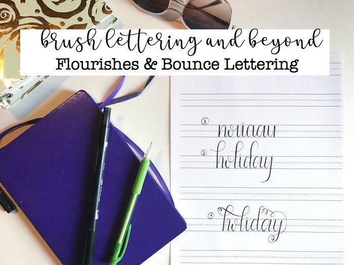
Welcome to the Brush Lettering and Beyond Blog Series. This is Part 4. This post will help you get started with flourishes and bounce lettering. This is a 5-part series. You can find the rest of the series at the bottom of this post.
 *This post may contain affiliate links. Please see my Disclosure for more information.
I have been so excited for this post for quite a while now. The main reason is that flourishes and bounce lettering were really hard for me to grasp, and I want to try to make the learning process a little easier. A lot of flourishing and bounce lettering is practice and finding your own style. However, the techniques I’m going to show you should make you feel more confident getting started.
Brush Lettering Flourishes
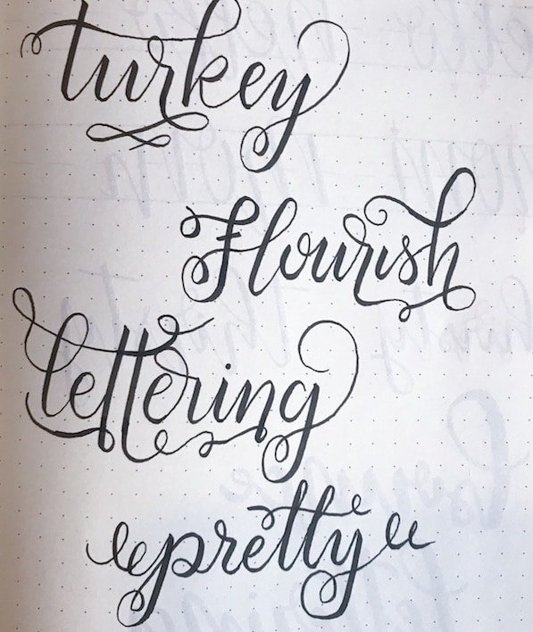
Flourishes are the added decoration and embellishment of lettering. It’s often associated with real calligraphy. But, talented artists have now incorporated it into modern brush lettering. Flourishes are the swirls you see at the end of letters, or the curly lines under or over a word. It’s not necessary, but it’s fun, and it challenges your creativity and problem-solving skills.
Flourishing takes a lot of practice. But, once you have an understanding of which letters are commonly flourished, you will pick it up quickly. Letters with descenders (g, j, p, q, y) are easy to add flourishes to. And letters with ascenders (b, d, f, h, k, l) have the same quality. These are typically where you will find flourishes. But, you can also add flourishing to letters that have trailing outstrokes, or tails. These letters are j, y, J, Q, R.
But, don’t feel confined by those commonalities. Practice and find a style you like, then start playing around with different embellishments.
Flourishing Technique
I can’t teach you how to do every flourishing technique as there are tons and each one has a different feel and look. Grab this book to really master the flourishes. But, I’ll show you a great way to start.
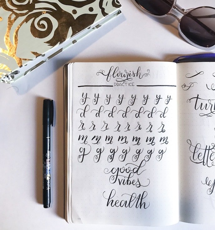
First, you may want to spend some time practicing letters with ascenders, descenders, and tails. This way you can get a feel for making the swirls and loops. Have a look at some of my practice letters below.
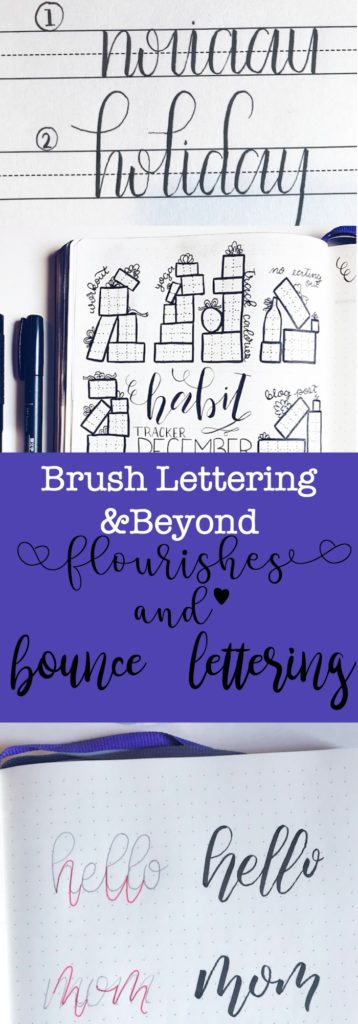
Now that you have a grasp on making letters with flourishes, you can start practicing words. Think of a word that has some ascenders and descenders in it. I’ll do ‘holiday’ as an example. Then, after you’ve chosen your word, you’re going to write it out without the ascending and descending pieces. Instead, create the bowls, stems, and spines. Need some quick definitions? Look at this Wikipedia article on Typeface.
So, your word should look something like #1 in this photo. It will look quite strange at the moment.
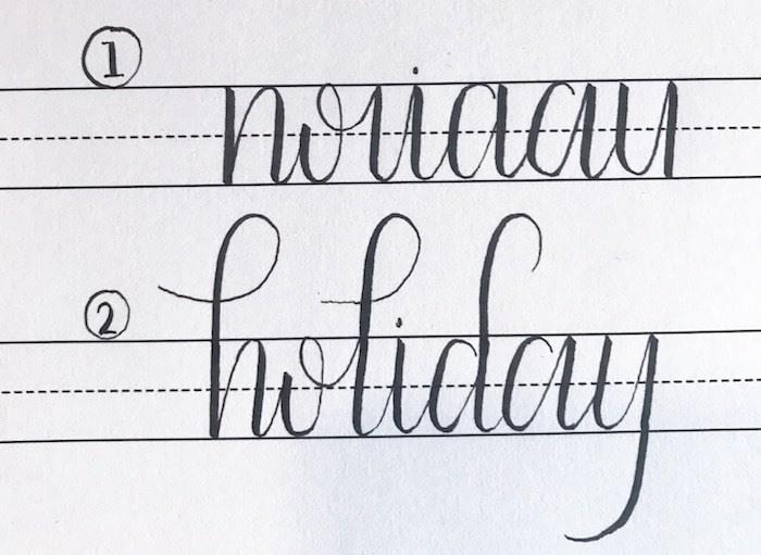
Then, you’re going to connect your ascenders and descenders. Before you start, think of which way you want them to curl. If you look at my example, you will see I looped back on my h and l, but curled the ascender on my d the opposite direction. This is completely individual and there is no right or wrong. Just try to think about what you want the end result to look like.
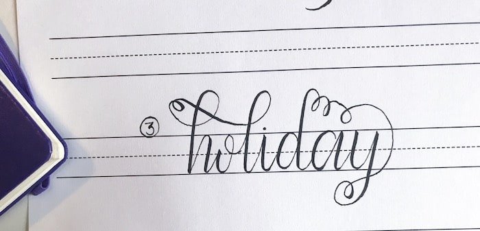
In the final step, you can connect and add more swirls and embellishments to your ascenders and descenders. Play around here and don’t beat yourself up if it doesn’t turn out the first time.
Bounce Lettering
Bounce lettering stumps a lot of people. I get a lot of questions on how to vary lettering height without it looking funky. But, it’s actually fairly simple. Basically, you are breaking the rules of basic lettering. You’re coloring outside the lines. Literally.
I highly suggest watching and following along with this course by Teela Cunningham on Skillshare. This is the course that really helped me understand and improve my bounce lettering. She teaches a technique called the Skeleton Method. She also includes a cheat sheet for letter direction, which is important in bounce lettering.
I have incorporated a basic version of Teela’s technique into this post.
Bounce Lettering Technique
Pick a word and write it out normally. You can do this in pencil first. In my example, I used a red pen to show you my intended changes, but you’ll just use pencil to start. Using pencil will allow you to go over your word with pen and get the final product you want the first time.
I used the words ‘hello’ and ‘mom’. As I said, write them out normally, staying within the lines. Then, look at your word and find the dips and arches. Where can you extend those dips and arches? Use your pencil to extend those areas up or down. Don’t worry about the initial markings.
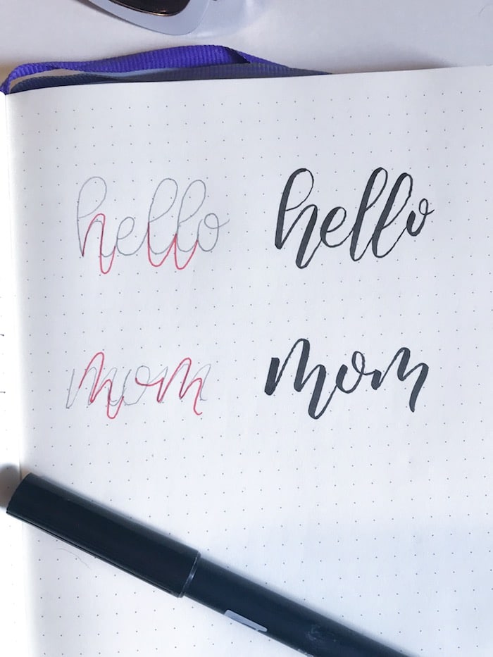
In my examples, you can see I wrote my word normally in pencil and then went over it with a red pen to show where I wanted to make changes (you will be doing this with pencil instead of red pen). In the second version, the finished product, I applied those changes with a black Tombow Fude Pen
Tell me what you thought about this post in the comments below. Did it help you? I would love to see your brush lettering practice, so be sure to tag me on Instagram or head over to my Facebook Page to share.
Other Parts in the Series
Want to keep up with this blog series? Join me on Facebook or Subscribe to my Newsletter to be notified when the next post comes out. Posts will be published every Thursday through November.