If you want to add some flair to your journal, check out this guide to fun and easy bullet journal headers.

This post may contain affiliate links. Please see my Disclosure for more information.
Whenever I really want to spice up a page, I like to use bullet journal headers. Because there are so many incredible styles of lettering and because you can incorporate textures, patterns, and colors, the opportunities are endless.
I know you have seen the incredible brush lettering artists and calligraphy style headers on Instagram and Pinterest. This post is NOT calligraphy-based, although… there are a couple that are cursive based.
If you want to learn how to achieve incredible and professional looking calligraphy, I highly recommend checking out Brush Lettering Bootcamp. It’s the VERY BEST brush lettering e-course on the market, in my opinion.
Instead, I want to show you how to create your own headers from inspiration, find sources of inspiration, and get started with a few fun and easy bullet journal headers.
Supplies for Creating Headers
Headers come in a variety of styles and colors. There is no right or wrong material. I’m all for experimenting and trying new mediums.
But, for the purpose of this post and basic instruction, I want you to have a good grasp of what works best for me. And also some supplies that I love, but don’t use on a super regular basis.
The Basics
The Extras
- Metallic Gelly Roll Pens – $15
- Tombow Dual Brush Pens – $15-$150
- Uniball Signo White Gel Pen – $4
- Zebra Mildliners – $24
- Watercolor Brush Pen Set – $10
- Stabilo Point 88 Pens – $40
- Pastel Gelly Roll Pens – $10
- Nib Pen Kit – $13
How to Use Lettering Supplies
Pencil & Eraser: In 90% of the lettering pieces or headers I do, I start with a pencil. Starting with a pencil ensures you don’t misspell a word, that you get your placement right, and that you can make any changes you want before going in with ink.
Fineline Pens: Aside from brush lettering and calligraphy, you will use fineline pens in most of your headers. The rich black ink creates contrast and the fine tip allows for precise lines and small details.
Tombow Fude Pens: These are great brush pens for beginners due to their smaller and more forgiving nib. You can read my guide to brush lettering here The Tombow Fude pens are also wonderful for creating smaller brush lettered headers in your weeklies.
Crayola Supertips: These are my daily go-to markers. They are inexpensive compared to the Tombow Dual Brush pens and other professional artist quality markers. But, they still provide a rich, saturated color. Also, it is totally possible to do brush lettering with the Supertips.
Gel Pens: The Gelly Roll pens and the Uniball Signo from the list above are both varieties of gel pens. Gel pens are wonderful for writing over other markers and pens. The white creates rich contrast on a dark background. It can also be used to cover up mistakes. The pastel and metallic colors can also be used over the top of other markers and can create fine details unlike broad tip markers.
Tombow Dual Brush Pens: They are the best in the business. They have a wide variety of rich, saturated colors and the dual tip allows them to be used for brush lettering, print lettering, and coloring. In my opinion, having a full collection of Tombows is the end goal. They last seemingly forever and are truly spectacular to work with.
Zebra Mildliners: Due to the wet nature of this ‘highlighters’ they provide colors that you can’t get from Tombows or Crayolas. The cool tones are unparalleled by any other brand that I have found. The color range is a nice addition to your art supplies.
Stabilo Point 88 Pens: When you want to add fine detail in color and can’t use a marker, these colored fineline pens are a must-have. They are great for outlining text, adding details inside hollow lettering, and adding embellishments.
Watercolor Brush Pens: These aqua brushes are an excellent addition to the Tombows. You can create wonderful watercolor headers with these. You can also create watercolor backgrounds, add soft ombre effects, and blend together different colors within the same word.
Nib Pen Kit: If you are a fan of lettering, you’ll eventually want to get a nib pen. There are so many different nibs to choose from that you can ultimately create just about any style of lettering you desire. But first, get a starter kit and practice creating thinner and thicker lines, dipping your pen, and writing with the instrument. They are wonderful for creating crisp print fonts and elegant calligraphy.
Inspiration for Bullet Journal Headers
Lettering is more than the penmanship they taught in elementary– do they even teach that anymore?
Lettering is an art form. Just have a look at some of these lettering artists who are commissioned for large murals, art pieces, and invitations.
Hand lettering is most definitely an art. Which means it takes a lot of practice, patience and trying different things.
Many of us get stuck doing the same lettering style over and over. For me it’s tall, skinny, print fonts in black ink and bouncy brush lettering.
But, when I want to make an impact or want to add some flair to one of my bullet journal pages, I like to use new font styles.
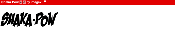
Whenever I’m looking for inspiration for a lettering style, I go to DaFont.com. DaFont is a website where you can download digital fonts to install on your computer and use in applications such as Photoshop or Powerpoint.
But, it’s also an excellent place to get inspiration for a new header font.
They have a variety of categories of fonts to choose from, including Western, Cartoon, Script, Groovy, Curly, Horror, and many more.
Here are a few examples of fonts that would be fun to replicate and turn into bullet journal headers.


Other Place to Find Lettering Inspiration
Aside from taking inspiration from font styles online, there are a few other places I have found inspiration for bullet journal headers.
Start being more observant of all the writing you see. This means on billboards, cereal and food boxes, restaurant menus, clothing, brand promotional content, etc.
If you are looking for more playful fonts and lettering styles, trying wandering around a children’s clothing store or looking at kids’ movies.
For fancy or elegant fonts, menus at nice restaurants, invitations, and photography logos can be inspirational.
Header Tips and Tricks
Before I close out and show you some of the headers I have created, I want to give you some lettering tips and advice to create headers you are always happy with.
- Always start with pencil. Do a very light sketch of the lettering style you are considering.
- For centered pieces, sketch out the middle letter of your word or phrase directly in the middle of the page. Then fill out the letters on either side.
- Use pencil to sketch out the shape of your text if you are creating arched, wavy, or slanted text.
- Pair bold print fonts with delicate script fonts. You can also pair larger script fonts with smaller less intricate print fonts.
Play around with different style and practice your lettering often. Even if you don’t have any intention of becoming a renowned lettering artist, frequent practice will open up your creativity and improve other artistic skills as well.
Fun Bullet Journal Headers to Try
Below is a video of some headers I recently created. I like to keep a few pages in my journal where I practice different headers and then use these pages as a reference guide. Give them a try in your own bullet journal.
Most of these are larger headers and I recommend using them to title a page rather than smaller sections within your page.
You may also get some inspiration from this post with additional bullet journal header ideas.
Let me know which one was your favorite in the comments below. And I’m curious, do you prefer to use just black ink or do you prefer using color on your pages?